Unveiling the 15 Worst Website Designs to Avoid this Year
Our independent research projects and impartial reviews are funded in part by affiliate commissions, at no extra cost to our readers. Learn more
Sometimes to get an idea of what you should do, you have to take a look at what you shouldn’t do.
Some website builders are better than others at helping you design a stylish website, reminding you to include great navigation and engaging imagery. But what about the design choices you should be avoiding?
While we know you should never judge a book by its cover, we’re all guilty of judging a business by its website. We’ve put together a list of 15 bad websites on the internet, all with poor design and functionality, to show you the design elements you should be steering clear of.
You’ve been warned, what you’re about to see isn’t pretty!
Criteria for Worst Website Designs
When you’re designing a website, what actions result in a bad website? You’ll likely see a few of these factors on a poorly designed website:
- Outdated design trends: While we all love to follow the trends, some web design choices belong firmly to the past. If you’re still tempted to use clipart on your website, for example, step away from the computer.
- Poor usability and functionality: When it comes to web design, we aren’t just talking about how your website should look. It should also function well and be easy for users to navigate and use.
- Cluttered and overwhelming layouts: Once upon a time, it seemed like web designers were allergic to white space. Nowadays, you don’t need to fill every gap on your web page since cluttered websites are overwhelming and off-putting to users.
- Inconsistent branding and messaging: Your website should portray your brand style and message. Stick to the same color scheme, font style, and tone of voice throughout.
Now, let’s take a look at 15 of the worst-designed websites we could find.
1 - Arngren.net
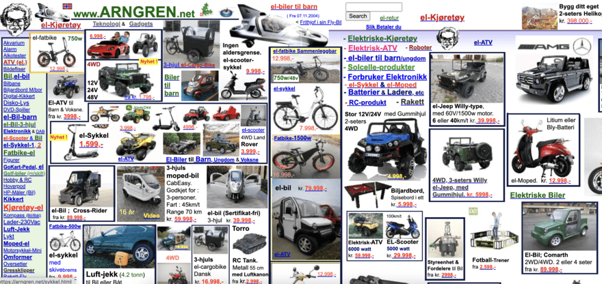
Arngren.net sells vehicles and electronic products in Norway. The design is cluttered and overwhelming – the moment you land on the homepage you’re presented with a mass of products and information.
The images are poor quality, and there’s no sense of branding or style, not to mention the lack of organization when it comes to product categories. This website is like an online jumble sale… and not an enjoyable one!
For some reason, the website footer is a Christmas animation all year round, and the header features holly and ivy… in July.
Avoid falling into the same trap as Arngren.net and organize your products into clear categories, with separate product listing pages for each. And make sure you’re keeping your website up-to-date to avoid any seasonal errors!
2 - LingsCars.com
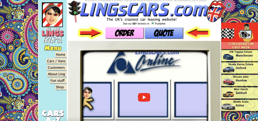
Lings Cars is a car leasing website that looks more like a children’s gaming website than a professional car leasing service.
The design is chaotic with an excessive use of bright colors that leave you wishing you’d put your sunglasses on before landing on the homepage.
The website claims to be “the UK’s craziest car leasing website” and they’ve certainly got that right with animations of Ling himself dotted throughout the website and a vibrant, psychedelic background that has little to do with the actual cars.
Speaking of the cars, they’re hidden among bright colors and graphics, so much so that it’s not immediately obvious what the website is even offering users.
When designing your website, stick to a branded color scheme. And, unlike Lings Cars, make it clear straight away what products and services you offer customers.
3 - WebsitesThatSuck.com
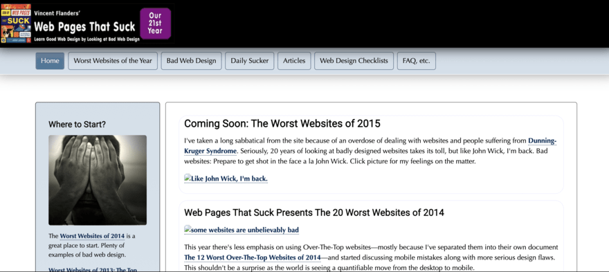
Well, this is definitely one of the most ironic bad websites to make the list. Websites That Suck is a site dedicated to showcasing bad web design practices.
The website lacks any kind of user-friendly interface and navigation – it features a clunky header menu and unclear links and navigation markers.
The homepage simply lists all of the blog posts on the site, and the lack of images and plain black-and-white color scheme make this website boring and uninspiring.
Remember the importance of engaging your audience the moment they land on your website and make sure your navigation is clear and easy.
4 - Drudgereport.com
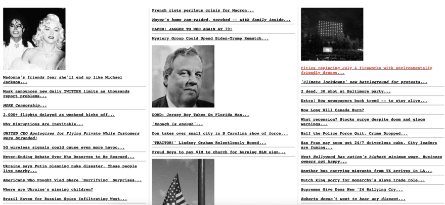
Drudge Report is a news aggregation website that looks more like a page of links than an engaging content hub.
The layout somehow manages to be both crowded and simplistic at the same time, and the excessive use of text links is overwhelming. The opposite of a user-friendly website!
The black-and-white color scheme stretches to the website’s images, leaving visitors feeling underwhelmed and uninspired.
To avoid making your visitors feel the same way, opt for a clear and well-organized layout when presenting masses of content to users, and don’t be afraid of using some color (providing it’s on brand!).
5 - LakesideDentalSmiles.com
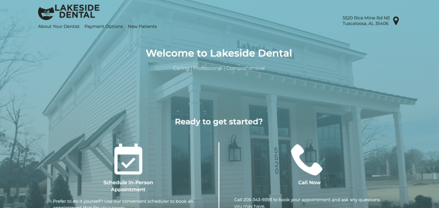
If Lakeside Dental Smiles hopes to portray a professional and welcoming dental practice to potential patients via its website, it isn’t doing a very good job.
The layout is cluttered and the excessive use of stock images means the website lacks personality.
The masses of text information about the practice’s services are difficult to read and the large chunks of text are overwhelming for potential patients.
Rather than putting patients at ease, the website creates a sense of stress and doesn’t instill faith or reliability in the practice.
Services such as dentistry require you to build trust in your business, so we’d recommend including real-life photos, easy-to-read text, and patient reviews on your website. These will help to ensure your website fares much better than this one.
6 - Shambles.net

Never has a website quite lived up to its name as much as this one. Shambles by name, shambles by nature.
Shambles.net is meant to be an educational resource website, but the homepage just looks like a page of ads and text links.
The website has tried to include good design elements, such as adding a QR code to access the mobile website and offering a search functionality, but they don’t quite hit the mark.
The design is outdated and looks more like a website from the nineties rather than 2024, and it’s difficult to understand where the relevant materials are and how you access them.
Avoid making your website complicated like shambles.net and if you’re hosting resources, include clear pointers and CTAs that direct users straight to them.
7 - AlphaDictionary.com
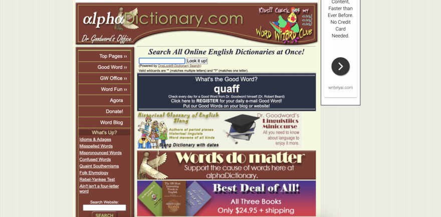
Unfortunately, AlphaDictionary makes the list as one of the worst-designed websites thanks to its dated design and cramped layout.
The dictionary website features far too many links and elements on the homepage and the main function of the website, the search feature, is lost in all the imagery and graphics.
The website not only features definitions but interactive games and blog posts, too. All of which could be great content for users if they weren’t so hard to find.
When designing your own website, ensure the main purpose of your business or site is featured prominently. Whether it’s ecommerce or blogging, don’t let it get lost in the noise of your website’s design.
8 - Craigslist.org
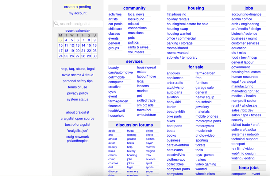
Craigslist is a pretty well-known website so it might come as a surprise to you that it’s made the list of worst websites. However, thanks to its plain and outdated design, it’s earned its spot on the list.
The listing website features masses of content but the navigation and search options are limited, making the overall experience of using the website hard work.
There’s next to no visual appeal – the homepage simply features extensive lists of links to listing categories. And if you’re new to Craigslist, there’s no information or guidance on how to navigate the website.
To make sure you don’t mirror Craigslist’s poor user experience, be sure to include clear CTAs and navigation buttons throughout your website to make the user journey obvious.
9 - Pacific Northwest X-Ray Inc.
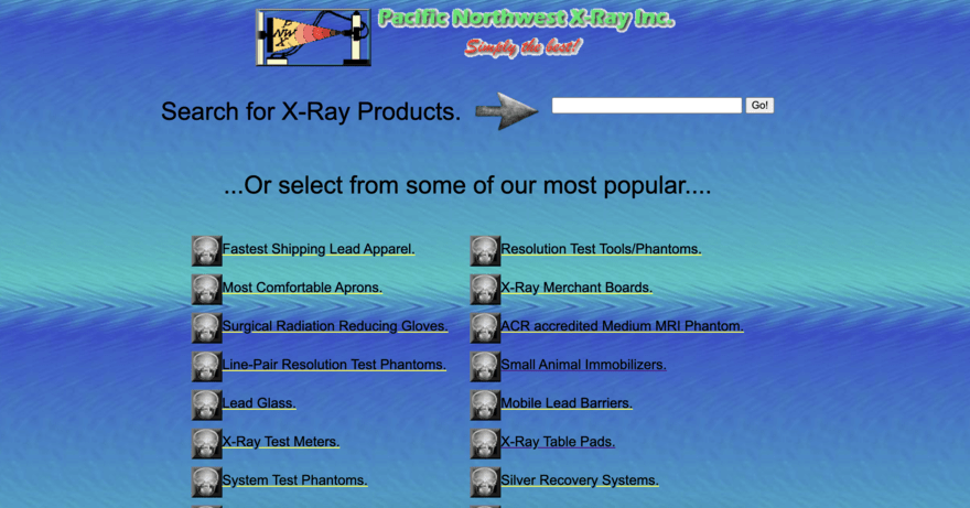
Pacific Northwest X-Ray Inc. provides X-ray products such as table pads and lead curtains.
For some reason, the brand has opted for what looks like an underwater theme for their website (no, we don’t get it either) and the product listing pages leave plenty to be desired.
The images are low quality, there’s far too much information, and the prices are displayed on small tables that get lost against the vibrant background.
When it comes to designing the product pages for your website, be sure to make them engaging and easy to read, with key information such as prices and customer reviews easy to find.
10 - ACME Laboratories
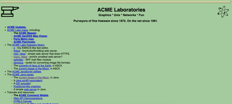
ACME Laboratories’ website states that the business has been “on the net since 1991”. To be honest, it looks like the website hasn’t been updated since then!
We’re not even sure what this website and business does, but it seems to offer graphics, freeware, and fun (the last one is debatable).
The website is just one long list of available freeware and graphics, each with a link that takes you to a product page with yet more links and content.
The whole website needs an overhaul and it wouldn’t be an overreaction to name this a potential winner for the worst website ever.
Remember, sometimes less is more when it comes to copy. If you do have a lot of content and links to include, make sure you break it up with images and interactive elements.
11 - Atari Best Electronics

This website, Atari Best Electronics, provides replacement parts for Atari electronics. The homepage is overwhelmed with so much text that it’s almost impossible to read. The random use of vibrant font colors doesn’t help either.
We’re not convinced we’ve ever seen so much text on a single webpage before and this looks more like a Word document than a website.
Navigation is almost impossible thanks to the fact that links are hidden within the text, and it’s difficult for users to understand what are clickable links and what aren’t.
If you have a lot of content to feature on a single web page, be sure to break the text up with formatting tricks such as subheadings, bullet points, and information boxes.
12 - Vortex Technology
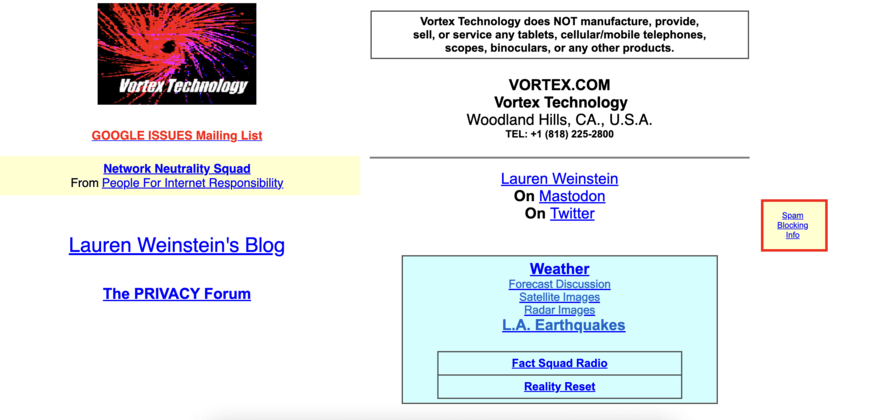
The first thing the Vortex Technology website does is tell you what it doesn’t do. However, what the website fails to do is tell users what it does offer.
The website is a tech-based website that hosts an on-site blog about the latest digital and tech updates, and randomly… weather forecasts.
The homepage of the website takes the concept of using white space to a new level and the simple page looks like something you would have designed on Microsoft Paint in 2002, as opposed to a high-quality website built today.
Unless you were actively looking for Vortex Technology then users who accidentally land on the site have no real way of knowing what the website is about and what it can offer them. We can only imagine that the bounce rate is pretty high for this one.
Don’t make the same mistake and make sure your homepage lays out the aims and purpose of your website from the moment a user arrives.
13 - MGBD Parts & Services

One of the worst websites we came across was MGBD Parts and Services, a company specializing in parts for Rover P6 vehicles.
Whoever designed this website has clearly tried hard. They’ve opted for each button to have a background of a Rover P6 which might have worked if you could read the text on top of it. And the use of images and color blocks do catch your eye, even if they’re somewhat overbearing.
The website design is cluttered and dated, and the navigation is unclear, making it difficult for users to find the products they’re looking for.
We recommend you choose design elements that look good and are functional. You want your website’s content to be legible and accessible for all.
14 - Mercia Tourist Board
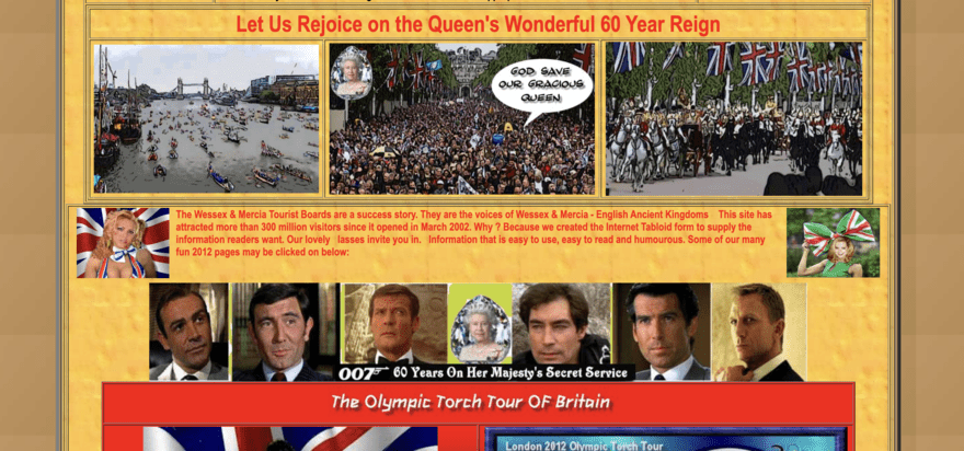
This website, Mercia Tourist Board, claims to be the unofficial tourist board for regions in the UK called Wessex and Mercia.
The design of this website is a lesson in less is more – it uses vibrant colors, hard-to-read fonts, and multiple images, combining to make the overall appearance chaotic.
There’s tons of content on the website but it’s all shoved on the homepage which makes it hard to pick out aspects that you may want to read and explore.
The website also claims to have had 300 million visitors since it launched in March 2022 but we can’t help but wonder how many of those managed to find what they were looking for.
Hosting a large quantity of content on your website doesn’t mean you can’t still opt for a clean and simple design that showcases your content to your online visitors.
15 - Industrial Painter

The website for The Industrial Painters, a business for commercial painting contractors, could be drastically improved.
The design is simplistic, but the dark blue and black color scheme is harsh on the eyes.
There’s no sense of brand identity either, with the website featuring a mix of stock imagery, unique brand images, cartoons, and animations.
While the homepage does have a sidebar menu, the brand has also chosen to add a menu in the middle of the homepage – a choice that seems bizarre to us and creates a poor user experience.
Making navigation easy is a key web design requirement so make sure your navigation menu is straightforward to find. You can even choose to use a “sticky” menu which means it will remain at the top of the page as users scroll through your content.
Worst Website Designs: Summary
All of these bad websites have plenty of things in common. Poor navigation, dated designs, cluttered layouts, and poor user experience.
Whether you’re designing a website from scratch or updating an existing design, understanding the worst website designs can help you avoid them making an appearance on your own website.
The world of website design has come a long way but these 15 worst websites all have some catching up to do if they want to keep up with the competition online.
If you found this article useful why not check out our ultimate guide to building websites to help you make even more informed web design decisions?
Frequently Asked Questions
Following web design trends isn’t a bad thing and it’s OK to include them within your web design. If you want to include popular or trending design elements just be sure to assess whether or not you think they’ll stand the test of time. We recommend you try to combine trend-led design features with more timeless options. If you want to go against the trends, you need to be smart about it and keep the user’s needs as top priority. Take a look at these weird websites for examples of sites that successfuly break the mold with their whacky web designs!
Absolutely! You can always change the design of your website whether you want to make some small tweaks or embark on a total design overhaul. Before you do so, take the time to research how you want your website to look, and don’t rush any decisions.
You don’t need to be able to know how to code to design a website. Website builders such as Squarespace and Wix allow you to build a website with no coding experience at all. These platforms also offer templates you can use to ensure your website design is up to scratch.
Leave a comment