Discover the Top 11 Food Truck Websites Setting Trends in 2024
Our independent research projects and impartial reviews are funded in part by affiliate commissions, at no extra cost to our readers. Learn more
The food truck is where convenience meets culinary creativity. But as with all food businesses, a great website is still a must. Luckily, there are some excellent food truck website examples out there, many of them built with some of our favorite restaurant website builders.
Whether you’re a food truck aficionado aiming to refurbish your website or a seasoned chef with grand dreams of a kitchen-on-wheels, the top 11 food truck website examples we’ve collected below will serve up some seriously mouthwatering inspiration.
Food Truck Catering Company
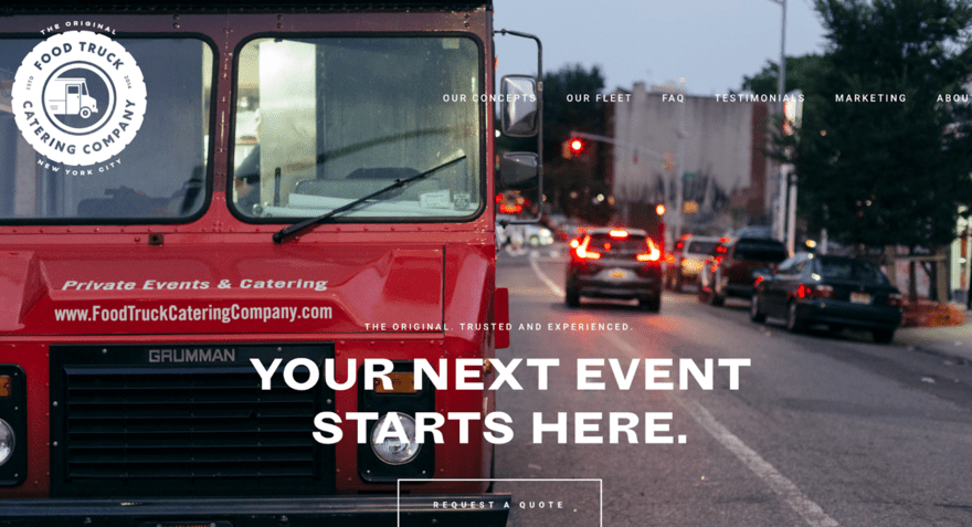
Food Truck Catering Company’s website is a professional showcase that engages visitors instantly. The layout is clean and balanced, with well-placed calls-to-actions (CTAs) like “Request A Quote” prominently featured.
As you scroll, the owner’s journey and customer praises unfold, enriching the narrative further. A full-width hero image flaunts FTCC’s vibrant red truck alongside joyful customer snapshots peppered throughout.
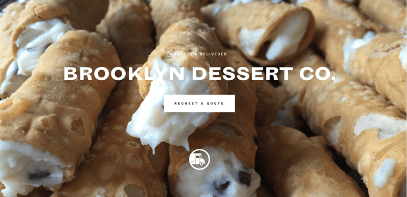
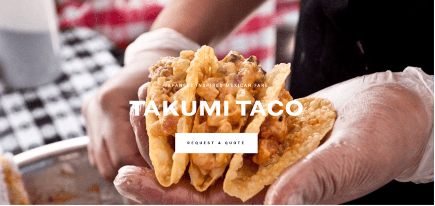
What captivates us most, though, are the enticing visuals of lush desserts and hearty tacos alongside delightful scenes of people savoring the fare. It brilliantly entices online customers with a website that’s built to make the mouth water and showcase its different food truck offerings.
Zia's
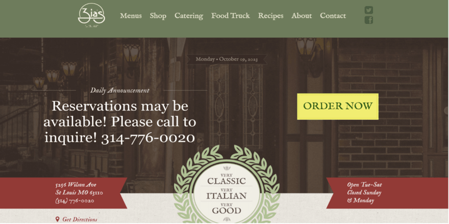
Nestled in St. Louis, Missouri, Zia’s On The Hill reaches customers with a well-curated website reflecting its food truck charm. Shying away from being overly flashy, it embraces elegance and simplicity with clear direction and easy navigation.
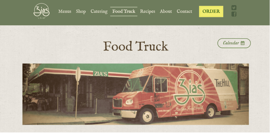
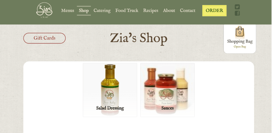
Indeed, the layout is user-centric, subtly enticing visitors towards Zia’s primary offerings. It’s fair to say that the website mirrors the brand’s warm ambiance in online form and serves as a fine example of blending simplicity with effective user engagement. It’s a great example of how to create a strong brand for anyone setting up their own food truck restaurant and online food ordering system.
The Tropic Truck
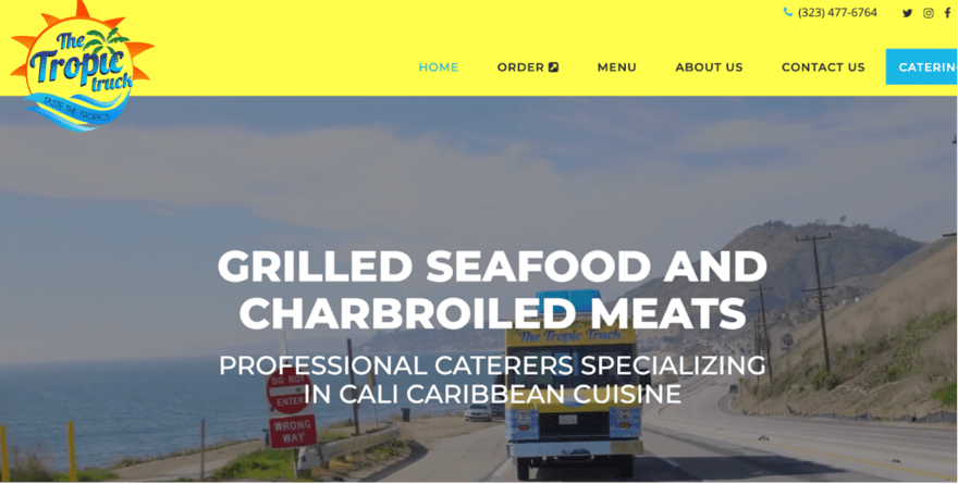
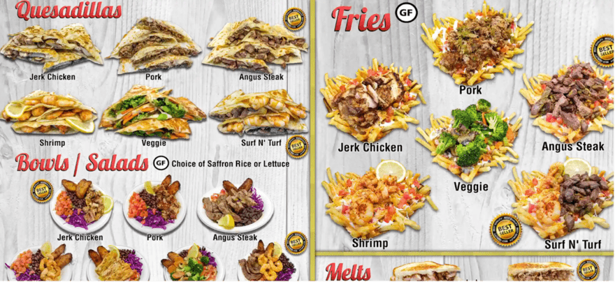
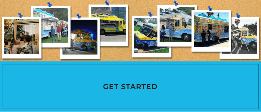
The moment you land on The Tropic Truck’s page, visuals of the truck, the expansive ocean, and picturesque roads seize your attention, perfectly setting the site’s Caribbean tone. What’s commendable is the seamless integration of functionality amidst this backdrop.
Right from the header, visitors have the convenience of placing an order for pick-up or booking the truck. This blend of aesthetic allure with user-centric functionality not only enhances the user experience but also entices visitors to explore the Caribbean culinary adventure awaiting them.
Curry Up Now
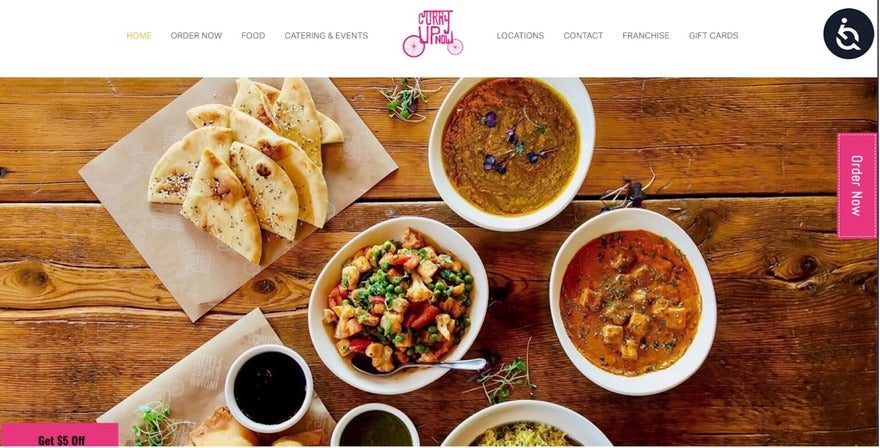
Expect a visual feast of Indian street food in the San Francisco vicinity with Curry Up Now. What started as one food truck is now four, plus five restaurants, two cocktail bars, and a catering business. The company’s narrative is beautifully carried through as soon as you land on the website and upon entry, visitors are greeted by an engaging header image showcasing what’s on offer.
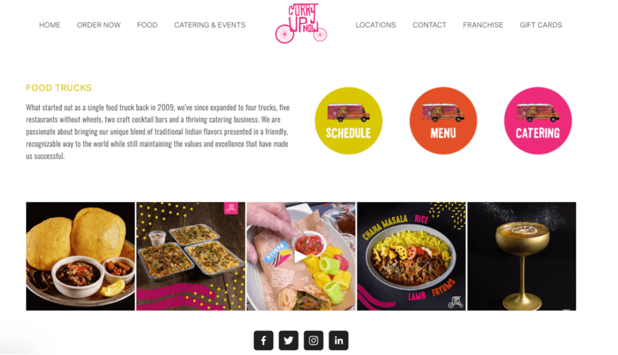
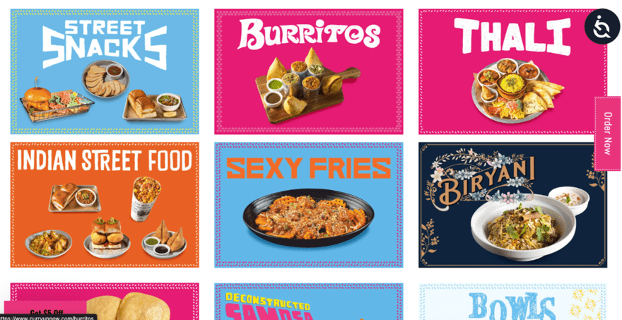
As you delve deeper into the site, the bold color palette unfolds and complements the easy-to-use online ordering system and digital menu. These features are not just aesthetic choices but crucial components that enhance the user journey, intertwining practicality with a vibrant visual appeal.
The Oyster Lover
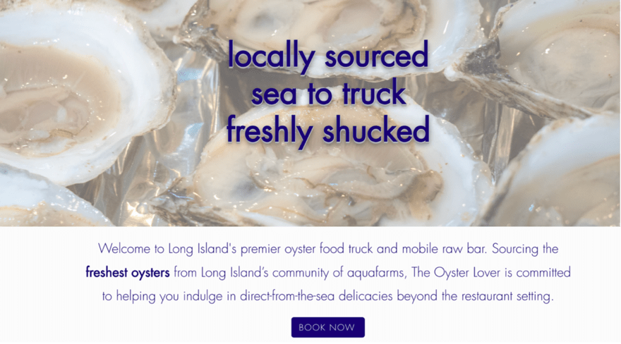
The Oyster Lover’s website steers clear of complexity with a straightforward layout that captures your attention right from the homepage. High-resolution images blend with detailed copy to set the tone, outlining the brand’s commitment to sustainability and health benefits right from the off. The inviting blue “Book Now” CTA is also hard to miss and offers an invitation to prospective diners to explore further.
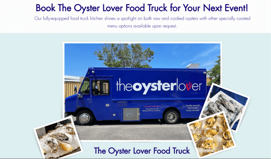
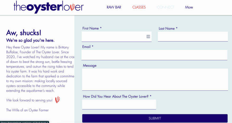
As visitors flick through the different pages, they’re met with a cheerful color palette and to-the-point copy. We especially like the detailed contact and booking forms that simplify the booking process for potential customers.
The Halal Guys
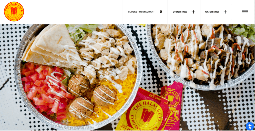
The Halal Guys is another brand that’s expanded from food trucks (or, in its case, street carts) to permanent locations. As for the website, it captivates visitors, drawing them in right from the hero section thanks to the use of video clips that show off the deliciously tempting dishes on offer.
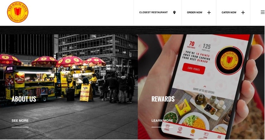
The overall website design encourages food exploration from the get-go on the homepage with its food-related icons that lead to detailed information on the cuisine. It also showcases the app for a seamless ordering and delivery experience. This means that users have everything they need in one place for optimum convenience.
The Salt N Pepper Food Truck

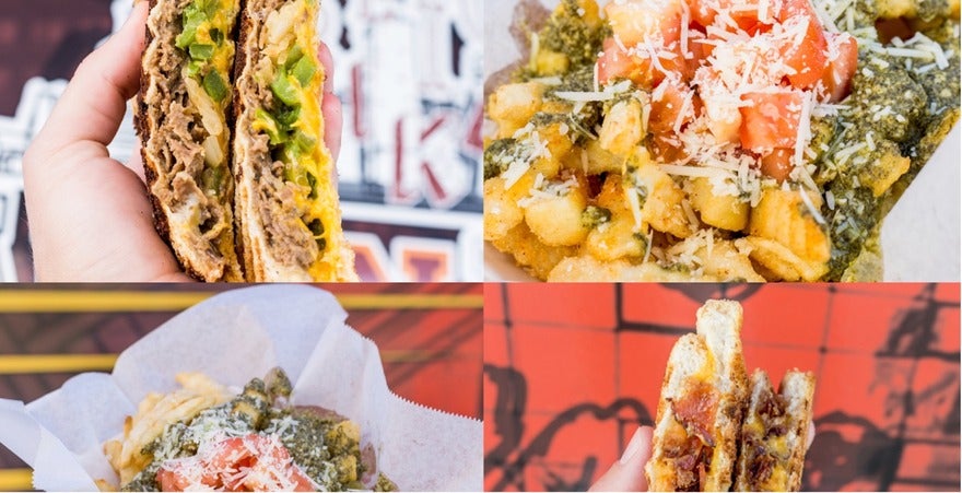
The Salt N Pepper Food Truck website exemplifies simplicity, making it an ideal food truck website template for beginners in the food truck business to emulate. With just a handful of pages, the site demonstrates a smart use of space and presents an array of savory meals enticingly revealed as you hover over the menu buttons.
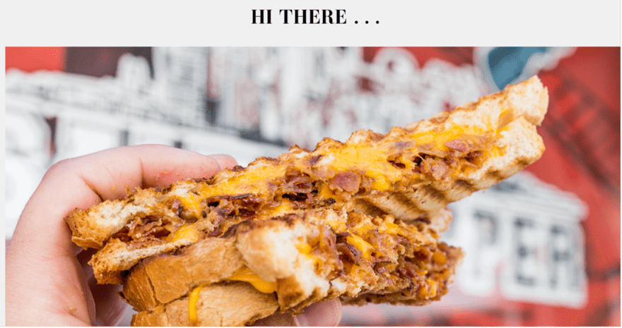
This clever interactive feature not only engages visitors but also provides a tantalizing sneak peek into the culinary delights awaiting them.
For anyone embarking on a food truck venture, following a straightforward yet engaging website template like Salt N Pepper’s can be a wise choice – the approach showcases the essence of the food truck’s offerings without overwhelming the visitor.
Watsons
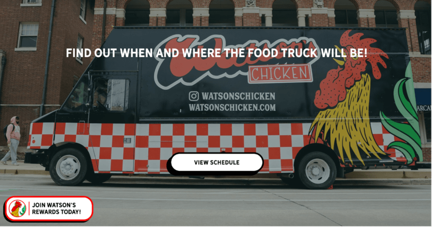
Watson’s boasts Southern and Cajun culinary charm and is renowned for its fried chicken sandwiches. The website is a blend of simplicity and elegance, immediately greeting visitors with a full-width banner image of its inviting locale.
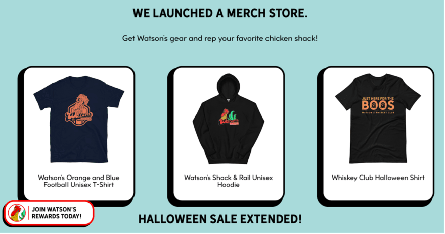
The color tone, weaving white, red, and brown hues, crafts a warm, welcoming ambiance. And effective use of white space ensures a clutter-free, easy-to-navigate layout. Additionally, a merchandise section extends the brand’s offering.
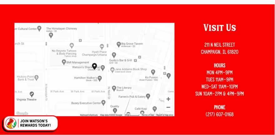
The warm color scheme is more than a design choice here and extends an invitation, exuding comfort, coziness, and familiarity to enrich the user experience from the first click.
The Cookie Bar
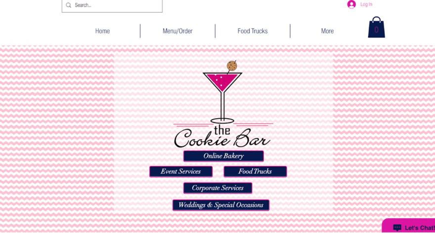
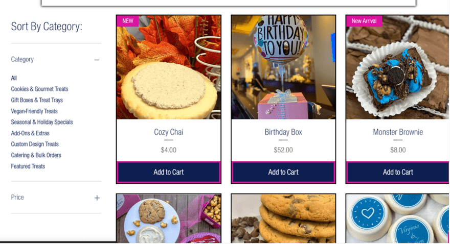
The Cookie Bar – and its delightfully enticing cookies – is a special place for anyone seeking a sweet retreat. Despite its straightforward layout, the harmony between the website’s colors and typeface is visually appealing and easy on the eye.
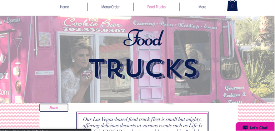
Creativity shines through in its imaginative and endearing logo, which adds a playful yet classy charm to the website. This continues in the overall design, however the use of white space results in a clean, uncluttered look that allows the content – especially the tempting visuals of cookies – to take center stage.
Cheddar Box
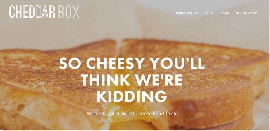
If you just so happen to seek a unique grilled cheese twist, then Cheddar Box will have your taste buds going into overdrive from the minute you land on its website. Minimalism takes center stage here, where stunning food imagery reigns supreme above all else – though the copy is pretty good, too. The opening image unveils a close-up of their tempting bites, which will have you reaching for the location sections.
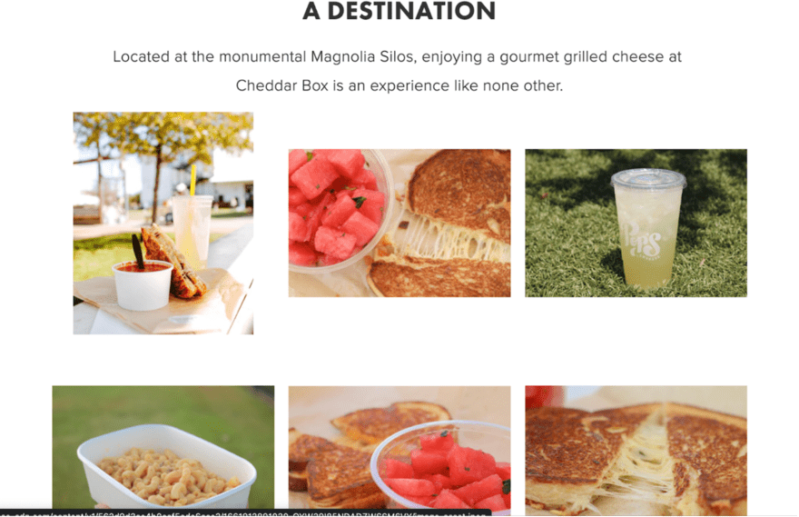
Cheddar Box’s website is a visual narrative, where imagery tantalizingly teases the palate, hinting at the culinary journey awaiting. It masterfully sets the stage, building anticipation for the real-life food truck visit, making users all the more likely to place an order.
Miffies Plant-Based Coffee
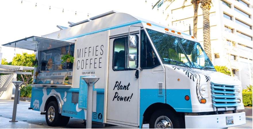
Looking for coffee truck design inspiration? We recommend checking out Southern California-based Miffies. Its website offers an effervescent blend of vibrant colors, animated imagery, and a heartfelt narrative of the coffee it serves. Each element intertwines to craft an atmosphere that’s both buoyant and welcoming.

Miffies takes extra care to let visitors know its story, going into detail about the business and the vegan coffee it serves. This adds a personal touch that makes visitors feel welcome and therefore more likely to visit the truck in real life. As with any small business, making a connection with your potential customers is crucial.
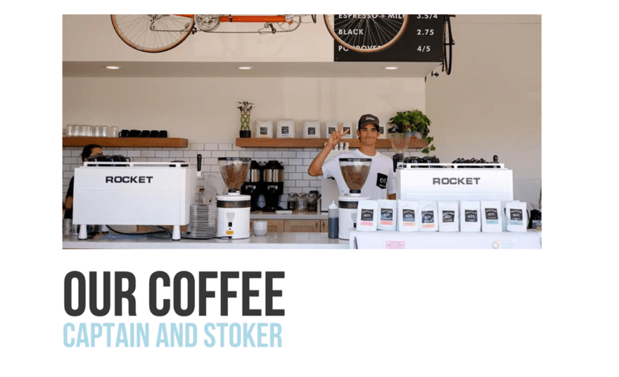
The site exudes warmth, reflecting the atmosphere of a quaint, cozy cafe. The easy navigation, coupled with the visual storytelling, evokes a sense of familiarity and comfort, making it a delightful preshow to the actual coffee truck experience.
Summary: The Top 11 Food Truck Website Examples
So there you have it. Our pick of the best food truck website examples out there! Although each of the featured food trucks serves a different type of cuisine, they all have one thing in common: they’ve perfectly engineered their designs to appeal to their audiences.
There are plenty of lessons to be learned from the examples above, but the biggest one is that simplicity is key when trying to attract paying customers. Smart, clean designs lead the way and allow striking shots of your delicious food and drinks to do the heavy lifting. Make sure your food truck website is a visual feast before giving your customers a real-life one.
If you’re still looking for inspiration, why not check out our list of the top restaurant website examples to really get your creative tastebuds going?
Leave a comment