10 Best Fonts for Websites – The Ultimate Guide to Choosing the Best Font
Our independent research projects and impartial reviews are funded in part by affiliate commissions, at no extra cost to our readers. Learn more
Picking the best font style for your website can make a huge difference. Not only do fonts affect the readability of your content, but they can also have a powerful psychological impact on your visitors.
Fonts are crucial for creating an awesome user experience, conveying brand values, and completing your web design.
This guide is packed with helpful tips to help you choose fonts for websites. From discovering the different font personality types to understanding what to avoid, we’ll talk you through everything you need to know.
10 Best Fonts for Websites
There are so many fonts out there, we know it can be hard to know where to start, let alone where to find your perfect match. That’s why we’ve compiled a list of 10 our favorite fonts for websites, to give you a jumping off point – with all 10 free to download from Google Fonts:
- Lato
- Merriweather
- Alegreya
- Arvo
- Amatic SC
- Josefin Slab
- Bowlby One SC
- Dancing Script
- Playfair Display SC
- Poppins
1. Lato
Lato is a wonderful sans serif font for websites – it’s clear, warm, and strong, and very readable. In fact, this is the font we use on our website! It pairs nicely with Open Sans.
2. Merriweather
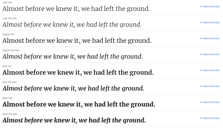
Merriweather was designed to be read on screens, making it one of the best choices for readability. It’s a serif font that comes with plenty of styles to choose from.
3. Alegreya
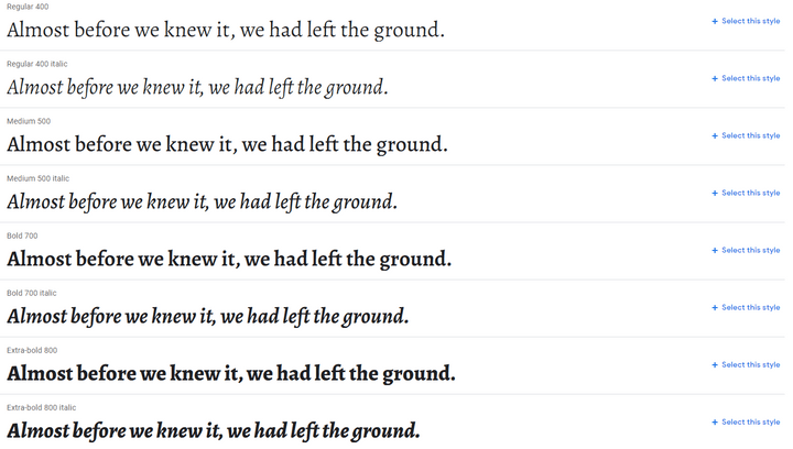
Alegreya comes with a classic look – it was designed for literature, making it perfect for longer bodies of text. It’s a nicely rhythmic and dynamic font that pairs well with Roboto.
4. Arvo
Arvo is a smooth, flexible looking font with its roots in geometric patterns. It’s an easy to read serif font that has a traditional vibe, without feeling stuffy or boring.
5. Amatic SC
This lovely hand-drawn font is perfect for headings. It’s simple and playful – we particularly like it because it doesn’t sacrifice readability for style.
6. Josefin Slab
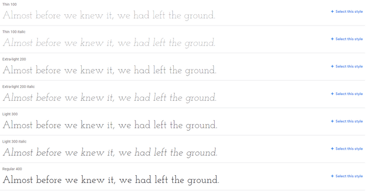
Josefin Slab is a modern, stylish font that’s perfect for bringing a sophisticated tone to any website. It works well for main copy, and would look good next to headings in Amatic SC.
7. Bowlby One SC
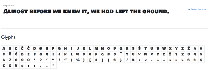
Bowlby One SC is designed for headings, and only comes in one style – we don’t recommend using it for your main copy. If you want impactful, bulky titles with slightly rough edges, however, then Bowlby One SC is a perfect choice.
8. Dancing Script
If you want a hand-written font style that’s sophisticated but also friendly and fairly casual, check out Dancing Script. It’s got a nice spontaneous feel – ideal if you’re aiming for classy without feeling stuffy. When used in headings, Dancing Script pairs nicely with Lato.
9. Playfair Display SC
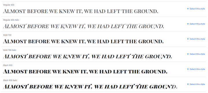
For headings with a traditional feel, Playfair Display SC is a strong and versatile font style. We especially like the subtle differences between the standard and italic lettering. For a version of this font containing lowercase characters, look at Playfair Display.
10. Poppins
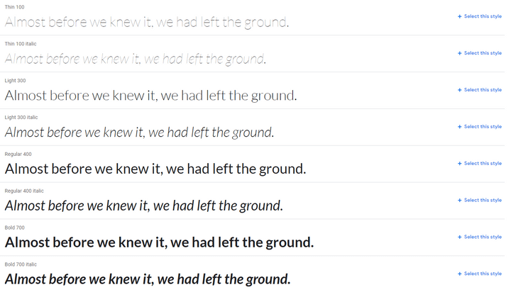
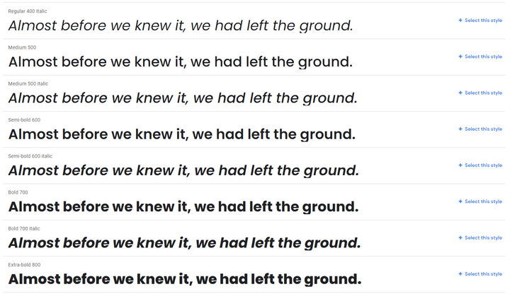
Poppins’ use of curves in its shaping gives it an open, friendly feel. It has a whopping 18 different styles to choose from, ranging from very thin and subtle, to heavy, bold designs. Our favorite is Extra-bold 800, which will really make your headings pop!
Why Are Website Fonts Important?
Your Font Speaks Volumes About Your Brand
Different font styles communicate different subconscious messages to people – which can help you build brand identity.
Online users are quick to judge – it only takes 0.5 seconds to form an opinion of a website, and 94% of that judgement is design-related. That means fonts are vital for convincing visitors that this is the right page for them, because fonts are a big part of a site’s web design.
As users, we read between the lines to understand what different fonts mean, and quickly judge websites based on the font styles we see. Specific font styles can convey different messages to people, such as trust, stability, strength, elegance and sophistication, and creativity.
Font Examples
There are four main types of font:
- Serif – these usually look more traditional and reliable
- Sans serif – these fonts convey modernism, strength, and style
- Hand-written script – usually associated with elegance, creativity, and the “personal touch”
- Display – unique, more varied designs that are intended for use as headings
We also talk about “modern” fonts in the infographic further down – this is a looser category based on appearance, rather than form.
The Right Font Can Create a Better User Experience
User experience is about making your visitors as virtually comfortable and happy as possible.
Excellent user experience should be the end goal of your web design and content choices. Why? Well, the happier your visitors are, the longer they’re likely to stay on your page, and the more they’ll engage with your website or business.
Good user experience could result in more clicks, conversions, shares, or repeat visits to your site, helping you succeed online. And a key part of user experience? You guessed it – choosing a readable, on-brand font!
- Fonts say a lot about your brand
- Visitors will judge your site instantly, based on its looks rather than its content
- Your chosen font determines readability – which is key for creating a good user experience
What Do Different Fonts for Websites Mean?
Just as different colors have different emotional and psychological effects on people, different font designs are able to convey different characteristics.
The infographic below gives you a clear idea on how different font designs have definite connotations and meanings. It quickly becomes apparent that fonts aren’t interchangeable – imagine trying to promote a strong, modern brand using the “elegant” font Bickham Script, for example.
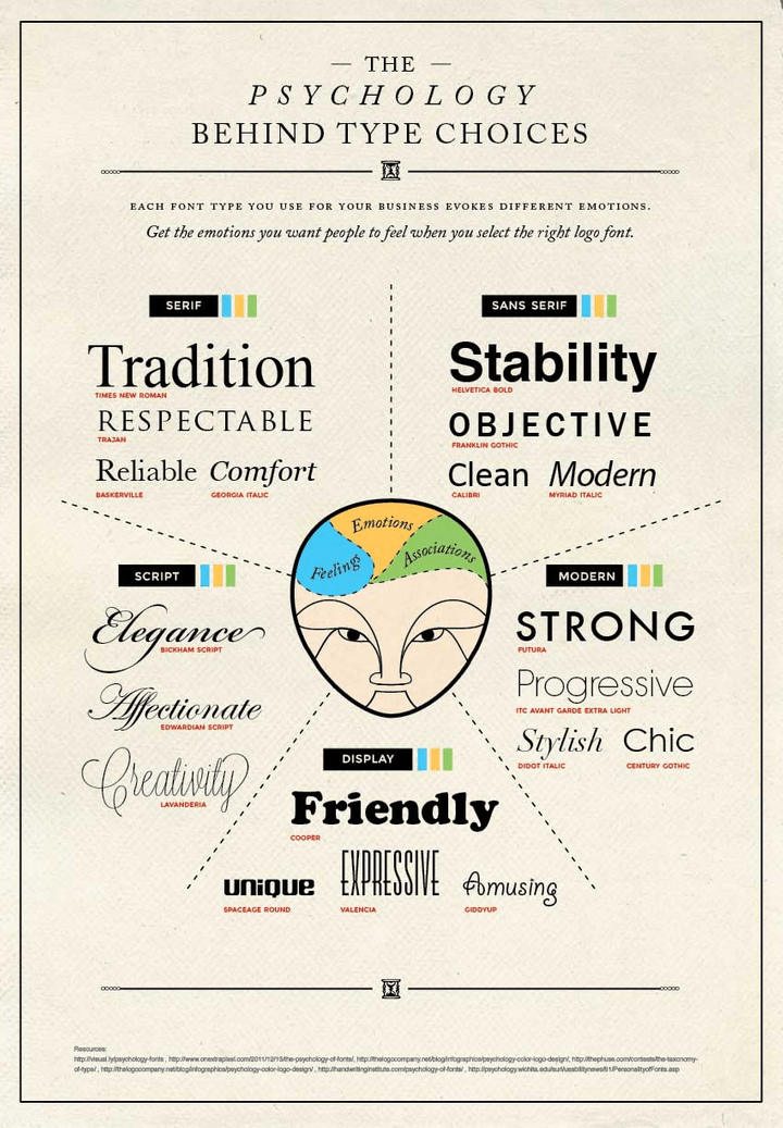
Using this infographic guide, it’s not hard to pick out the most suitable font design for how you want people to think of your brand.
Imagine you’re running a wedding photography website. You want to show clients that you’ll deliver tasteful, professional photos of their special day. Which fonts would be in your shortlist?
Our shortlist would include:
- Script font: Edwardian Script – for a traditional font with a flourish
- Serif font: Trajan – for making a statement, or impactful first impression
- Modern font: Didot Italic – for a more subtle, modern effect
It’s likely you’d throw out Helvetica Bold and Cooper fonts straight away, unless you had a very niche target audience!
Your target audience will determine your final choice – whether you opt for something fancy and classic, or something clean, stylish, and modern.
The 5 Font Personality Types
There are five main types of personalities when it comes to font designs. Think about your brand or website, and which personality suits it best as we go through each one – simply click on each personality type below to read more:
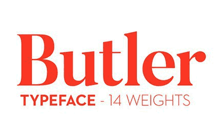
If you want your website to represent this personality, the fonts to consider should be serif font styles that look classic and traditional.
Examples include:
These fonts have traditionally been used in prints like newspapers, magazines, and books. Since most people are very familiar with these classic font designs, they instantly give off the impressions of heritage, reliability, and trust.
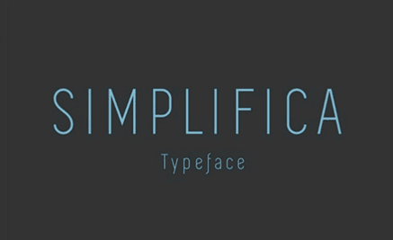
These are fonts with very clean designs and less handwritten qualities.
Examples include:
These font styles often have either very bold or very thin profiles. They tend to have less flair, leaning towards a more minimal design, which is why they appear more modern.
If you want your website to give off a more contemporary feel, then consider using this type of font design.
These sans serif, modern fonts tend to be more readable than handwritten or super blocky font styles, which makes them a good choice for the main copy on your website.
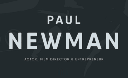
These fonts are very bold and have a blocky design. This boldness gives the design substance, and creates the impression of strength.
Examples include:
If you want to make a statement or appear robust, this is the type of font you should use.
Bold, blocky fonts can lose their effect if you use them all over your website – try using them for headings, logos, or pull-out quotes instead! You can pair a bold heading font with a clean, more lightweight font like Open Sans for your main copy, for maximum impact without sacrificing readability.
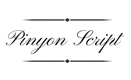
These are handwritten-type font designs with lots of curves. Indeed, it’s these curves that give the designs a romantic and elegant feel.
Examples include:
Not all handwritten font designs are romantic – they can also be quirky and free-spirited, such as the fun Giddyup font style. The more italic and curvy the font design, the more vintage it will look. The rounder the font design, the more quirky and retro it will appear to be:

Be careful when choosing handwritten script fonts, as they can be difficult to read – especially online or when used for long chunks of text. Always keep your reader in mind, and if you opt for a handwritten font, use it sparingly for best results.
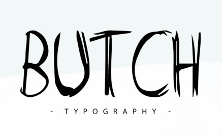
These are font designs that are so stylized, they don’t fall into any specific category. They can possess so many different characteristics that it’s hard to cover them all!
Examples include:
These font designs are handy if you want to create a unique brand identity. It will require more design skills to pick out the right design, since all of them are very specialized.
Here is a good resource to browse more about stylized font design.
Whether you’re launching your first website or hoping to revamp an existing site, learning the meanings behind fonts is a powerful tool to help you succeed. It’s a good idea to understand your brand first, and then find a font to match your brand persona.
Putting real thought into your font design is a quick and easy way to improve your brand identity, and create a strong connection with your target audience.
- Different fonts carry different meanings and create different emotions in readers
- Think about your brand and decide what personality you want to convey
- Serif fonts can convey: tradition, respectability, reliability, comfort
- Script fonts can convey: elegance, affection, creativity
- Display fonts can convey: friendliness, fun, uniqueness, expressiveness
- Modern fonts can convey: strength, style, chic, progressiveness
- Sans serif fonts can convey: stability, objectiveness, clean and modern minimalism
- People judge your fonts before they read your content – make sure your font matches your brand identity!
How to Choose a Font For Your Website
1: Start With Your Brand
A font may look nice, but if it doesn’t match your brand, it’s pointless. Always start with your brand before making design choices.
What personality does your brand have? Who’s your target audience? Once you know the answers to questions like these, you can pick out which font personality your brand aligns with, and set about choosing the perfect front style.
2: Pick Fonts For Your Readers
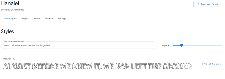
Try to strike a balance between your own personal taste and the needs of your audience. You may be head over heels in love with the font Hanalei, for example, but think about your readers – does this font suit their needs too?
In the case of Hanalei, its busy block letters and rough edges may delight younger audiences, but present a struggle for older readers.
Some questions to ask when trying to understand your audience include:
- What is the ideal age group?
- What is the preferred gender?
- What profession is he/she in?
- Does he/she have more/less disposable income?
3: Consider Readability
While it’s important for fonts to look good, it’s also important that they’re readable. Often, we like a font because it’s readable, not just because it looks nice – try to pick a font that not only represents your brand values, but is also enjoyable to read.
Stay away from totally unreadable fonts, no matter how visually stunning they may be:

Some fonts, such as dense, blocky styles or quirky handwritten designs, can be tricky to read when overused on a webpage – for this reason, they usually work best as heading fonts. Always choose an easy to read font for longer copy.
4: Put Your Font Through Its Paces
Before you commit to a font, see how it looks in all its different forms, sizes, and weights (the weight of a font determines how thick or thin the lines are).
- How does it look in different sizes?
- What do the uppercase and lowercase letters look like?
- How does it look in italics?
- How does it look when bold?
- What do the characters look like? For example, are numbers and punctuation easy to read in this font?
- Which weight would look best on your website?
As an example, the font style Cedarville Cursive is a beautiful handwritten script – but the uppercase “G” may not be to your liking, or you may prefer the traditional ampersand rather than the simple plus icon used. It’s always worth checking small details like this!

5. Explore Font Pairing and Hierarchy
Often, you will pair fonts on your website, using more than one to create a better visual experience. When you pair fonts you want to create a visual harmony and although it’s important for the fonts to contrast, you don’t want them to overpower each other and cause conflict on the screen.
When choosing which fonts to pair together you need to think about:
- Font weight
- Font style
- Font color
- Font size
For example, if you’ve found a serif font for your website, there may be a sans serif version that will compliment it perfectly.
When you are pairing more than one font on a website you need to make sure that each font has a purpose, usually to create a hierarchy within your content.
A font hierarchy is effectively an organization system that categorizes your content and tells the reader which information is important and which is secondary.
For example, you may choose to use a large, strong, bold font for your headings to draw the eye and capture users attention. You can then opt for smaller and softer fonts for your body text which are often easier to read for larger chunks of copy.
Your font hierarchy makes it easier for users to read your content and tells them exactly where to look for certain types of information.
6: Use Web Safe Fonts
Our last tip is to use web safe fonts. A web safe font is one that is universally installed across all devices, which results in faster loading speeds for your website. This keeps your readers happier, as they don’t have to wait so long for your content to load, and is also beneficial for your website’s SEO rankings.
Imagine you are a Financial Planner. Your ideal client group is millennials with good paying jobs, who are just starting to invest and plan for their futures.
When they visit your website, what kind of first impression do you want to make?
You probably want to appear responsible, trustworthy, progressive, and modern, because millennials most likely aren’t looking for old-school financial planners.
Instead, you want to project the idea that you can connect with younger, wealthier clients – your ideal target market.
So, how do you pick a font design that reflects those characteristics?
- Responsible & Trustworthy: You want to choose fonts that have a traditional heritage – like Trajan or Times New Roman – that give off a sense of history.
- Progressive & Modern: You want to choose a font with clean lines, a thinner weight, and more minimalistic design. This gives off a sense of modernism and progressiveness (see the fonts in the right-hand side of the infographic above).
Which fonts would be your top choice to meet these criteria?
We picked Aller (by Font Squirrel) as a solid font design for this new age financial planning business tailored to millennials.
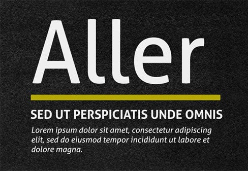
It has clean lines with a classic curve design, striking a good balance between new (modern and progressive) and old (trustworthy and responsible).
The font looks professional, and can send off the right subconscious signals to millennials looking for financial advice.
Using the infographic guide above, which fonts do you think are suitable for your website?
- Always start with your brand
- Pick fonts with your readers in mind, not just your own personal taste
- Make sure your font is readable
- Check your font in all its forms – bold, italic, numbers, punctuation, and so on
- Explore pairings and hierachy
- Use web safe fonts to help your content load faster for readers
Addressing Accessibility and Inclusivity
When choosing good website fonts, one of the most important considerations to take into account is accessibility.
As a website owner it’s your responsibility to ensure your website is accessible to everyone, including those with visual impairments. For those who are visually impaired, the wrong fonts can make reading content and navigating through a website impossible.
Below we’ve listed some of the key things to remember and consider to ensure your website font is accessible:
- Sans serif fonts are generally more “readable” on digital screens.
- Avoid fonts that have intricate details such as calligraphy style fonts.
- Consider the weight of the font and the contrast against the background. Ask yourself, does it stand out enough?
- Pay attention to the spacing and line height. Don’t make your content overwhelming or hard to read for users with cognitive disabilities or dyslexia.
- Provide font resizing options that allow users to adjust the font size on their screen to meet their own, individual needs.
- Select fonts that support a wide range of characters and symbols in order for your content to easily be translated into different languages for international users.
In order to ensure your fonts are fully accessible we recommend testing them before setting your website live. You can do this by either undertaking user testing to ask for feedback or running your website through an accessibility scanner.
7 Deadly Sins of Choosing a Font for Your Website
1: Don’t Use Tacky Fonts
Never use Comic Sans – ever. It might be something you want to use on your kid’s birthday party invitation, but tacky and funky fonts have no place on any websites that want to be taken seriously.
Each font design has its own personality. Depending on the design you choose, your font will give off a different impression of your website and your brand.
For example, the font “Papyrus” makes you think of ancient civilizations. It’s a font you’d expect to see as the title of an Egyptian mummy movie, and not adorning a financial planning website.
While these tacky fonts have their place in fun and hobby websites, please don’t use them on your website if you want to look professional.
2: Don’t Use Messy, Hard to Read Fonts
Picking a font design for your main content is very different from choosing a font for your title, headline, or logo. The purpose of your website content is to deliver useful information about your product or service offerings to your readers, so readability is very important here.
When in doubt, these are the font design you can always turn to:
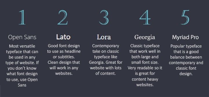
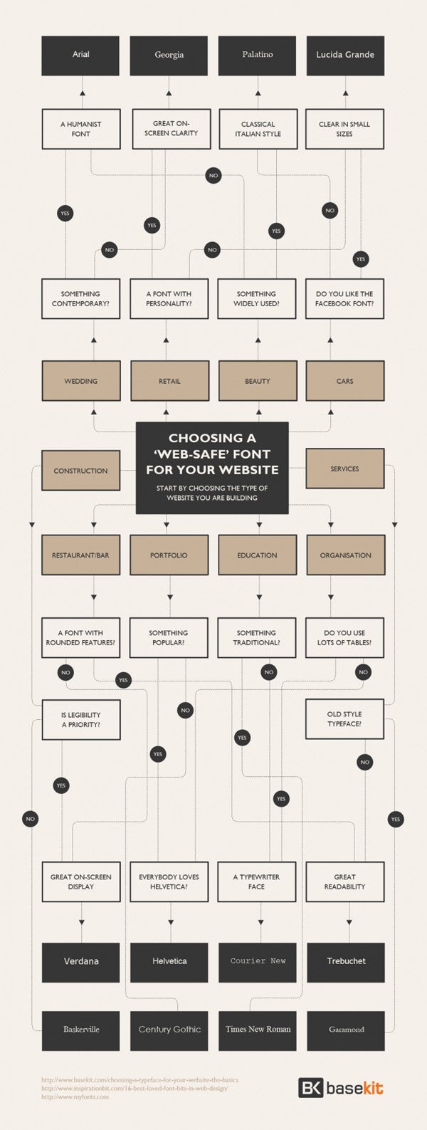
Here is a nifty Font Design Flow Chart from Basekit to help you choose the right font for your content areas:
3: Don’t Crowd Your Line Spacing
One of the easiest ways to make your content easier to read is to add enough spacing between each line.
The magic number of a perfect line-height is 150% of the font size you are using.
For example, if you are using 24px font size, the line-height will be 36px (which is 150% of 24px):
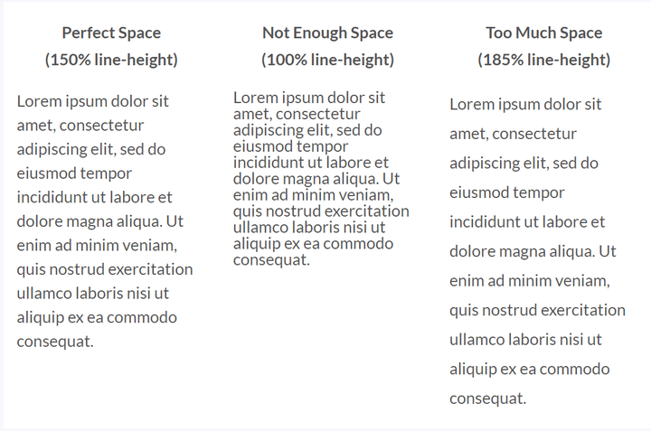
It’s pretty easy to see right away that the left column looks the best.
4: Don’t Use Too Many Different Font Designs
You should choose no more than three fonts for your website. Ideally, you should aim for just two font styles to use across your whole website:
- A font style for headings and page titles
- A font style for main content areas
- A font style for quotes or subtitles (optional)
Any more than this, and your web design can start to feel cluttered and confusing – and you’ll undermine that brand identity you’ve worked so hard on!
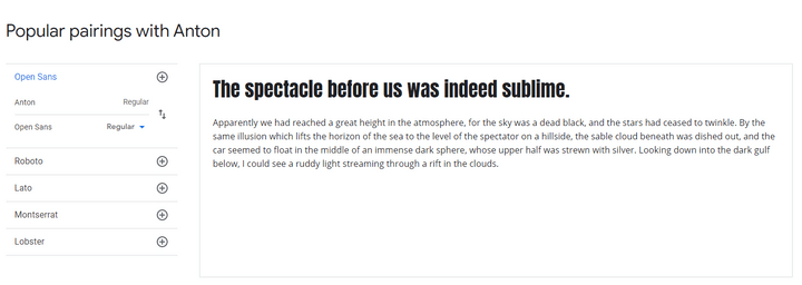
Try to find two fonts that complement each other – this is called a font pairing.
You’ll want a font for headers and a font for longer on-site copy, and you can have some fun matching up this pairing. If you find yourself struggling, Google Fonts provides pairing suggestions, and there are free online tools to help you too.
5: Don’t Use Too Many Font Colors
Color is a powerful branding tool. For example, when you think of Starbucks, what color(s) comes to mind? Most likely it’s the green that you see in their logo and on their website.
When you’re choosing colors for your fonts, only pick one or two brand colors that truly represent you or your business to use in your headline or sub-headlines.
Make sure your font color stands out clearly against your background color, so that it’s easy to read. There are free tools online, such as the WebAIM contrast checker, which you can use to make sure your font color meets readability standards!
Using too many colors, clashing colors, or the wrong color (lime green or pale yellow, for example) will make your website look messy, and make your content difficult to digest.
6: Don’t Pick Font Sizes At Random
Modular scaled font sizes will give your text a more harmonious appearance. This is a series of font sizes which possess the perfect proportion that the general public view as “beautiful.”
Recommended Font Sizes: 8, 16, 24, 32, 48, 64, 95
16px is the ideal font size for your main body text. It’s neither too small nor too big, so it really helps improve your paragraph’s readability. In fact, the font size we use in the main content areas of our articles is 16px.
8px is really too small for main copy – instead, you should only use this size for minor text, such as date stamps. For headings, feel free to play with the larger font sizes as you see fit!
Useful resource:
- Do you want a different font size than the ones we recommended? You can use this Modular Scale Calculator to create your own perfect font size scale.
7: Don’t Underestimate White Space
White space is the empty space surrounding content such as headlines, paragraphs, images, or buttons – and it’s vitally important for your web design. Making use of white space is one of the easiest things you can do right now to instantly make your website content easier to read.
White space stops your website looking cluttered, and gives your content more impact and “space to breathe” – which in turn makes it easier to scan and digest for visitors. White space doesn’t actually have to be white – it’s just the empty space between elements.
Some of the brands that use white space best include Apple, Squarespace, and Medium – experiment with white space on your website, and see what results you create!
White Space Examples
- Avoid tacky fonts such as Comic Sans
- Don’t use messy fonts that are hard to read
- Use a line height that’s 150% of the font size you’re using
- Don’t use too many font designs – choose two or three maximum
- Don’t use too many font colors – pick one or two brand colors
- Don’t pick font sizes at random – we recommend 16px for main copy
- Don’t forget to include white space
Useful Resources for Choosing Fonts
Whether you need a reliable place to download your chosen font style, or you’re simply searching for more inspiration, here’s a helpful collection of resources to get started.
Reliable Font Libraries
- Google Fonts – open source, free fonts for you to browse and download
- Adobe Fonts – fonts for those with a Creative Cloud subscription
- MyFonts – free and paid fonts (you choose the license type you need at checkout)
- Wild Type – free and paid fonts with a focus on creative designs
Inspiration
- Wix Fonts – 20 cool fonts to spark your imagination
- 50 elegant font designs – Canva’s list of stylish fonts
- How to Choose a Color Scheme – learn how to pick the right font color
Tools
- Coolors.co – easy to use color scheme generator
- Colormind Website Colors – view your color scheme on a demo landing page
- WebAIM Contrast Checker – make sure your font and background colors are readable
Best Fonts for Websites: Conclusion
Fonts are important. They convey meaning, and can make or break your brand identity. People judge your fonts before they’ve read a single word of your content, so picking the best font style is key to making that vital first impression.
Now that you know why fonts are important, and which ones suit your brand the most, you’re ready to start picking your very own font styles! We’d love to know which fonts you choose, so drop us a comment letting us know your favorites!
Frequently Asked Questions
A personal font license allows you to use your font for personal use, on private projects. If you’ll be using your font to make money (for example, making cards or tote bags), you’ll need a commercial license.



49 comments