11 Stunning Parallax Website Examples: Elevate Your Design
Our independent research projects and impartial reviews are funded in part by affiliate commissions, at no extra cost to our readers. Learn more
Parallax scrolling is an increasingly popular web design technique. Essentially, it involves creating the illusion of depth and texture on a webpage, by moving different elements around – at different speeds – as the user scrolls.
By imposing a 3D-like effect on a 2D environment, parallax scrolling cultivates an immersive, engaging, and multi-layered experience. That may sound pretty complex, but as you’ll see from this list, some of the best parallax websites are built using easy to use website builders you’ve already heard of, like Squarespace!
So what are the advantages of parallax design, exactly? And, more importantly, which websites across the internet are doing it best?
Below, we’ll answer those questions – and more. We’ve collected the top 11 parallax scrolling websites to impress you, inform you, excite you, and entertain you. But above all? Inspire you!
Advantages of Parallax Design
Parallax design has a wealth of uses and applications – and can create a huge range of unique visual and storytelling experiences.
Some of the key advantages of parallax design include:
- Engaging your users: parallax design is visually appealing, arresting, and attention-grabbing. It seizes your website’s users by the lapels and invites them to explore: to dive deeper into your site’s content.
- Telling your brand’s story: with parallax scrolling, you can create not just an experience, but a You can guide your users through a story by presenting different elements and sections of your site sequentially – creating intrigue and excitement in the process.
- Putting your products in the limelight: parallax design is a particularly effective technique for showcasing your products and services. Whether that’s offering your users a 360-degree view of a handbag, a look inside the first chapter of a book, or allowing them to zoom in for a close up, parallax scrolling and product showcasing go hand in hand.
- Boosting your conversion rates: with engaged users spending more time on your website, your conversions should follow suit.
- Setting your business apart from the competition: considering how incredible the effect that parallax scrolling produces is, the technique is still remarkably underutilized throughout the internet. By applying its principles to your website, you help your business and brand stand out – in an increasingly crowded market.
Parallax Website Examples
To help you get excited about building your own parallax website, we’ve curated the top parallax website examples from across the internet.
From tributes to classic 80s movies to Scottish street food, the content of these 11 websites is weird, wonderful, and bears little in common with one another.
What they do all share, though? Brilliant, engaging parallax scrolling – so let’s dive in!
1. Dopegood
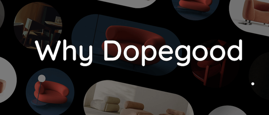
Dopegood is a New York-based ecommerce store selling a wide range of furniture – though, if we’re honest, it’s Dopegood’s website that steals the show.
Moving the cursor across images of chairs, sofas, and lamps, each shape swivels and somersaults. Scrolling through the “Why Dopegood” section (pictured, in static form, below) sends images of sofas and chairs sliding, as if in procession, on a diagonal angle.
Furniture catalogs follow: swishing in from the left, then the right, of the screen as you make your way down the page – giving the whole site a refreshing sense of kinesis and liveliness.
It makes you think – if the website’s this good, how amazing must the furniture be!
2. Get Some Fresh Air
As a website, Get Some Fresh Air is about as unique as they come. As a parallax scrolling website, it’s an extremely engaging, immersive experience which, given its cause – raising awareness of domestic violence by encouraging people to explore and examine their own behaviors and beliefs – is of crucial importance.
Get Some Fresh Air invites the user to first choose a character (pictured below), before leading them on a series of simulated outdoor journeys.
It’s a truly remarkable website that needs to be seen, and interacted with, to be believed. And it’s an excellent example of how parallax scrolling, combined with gamification techniques, can highlight a particularly sensitive issue in an accessible, tactful way – and help make the world a better place in the process.

3. The Goonies
Built with Webflow, this incredible homage to the classic 1985 film The Goonies isn’t simply a nostalgic time capsule. It’s a striking example of a parallax scrolling website – done well.

The website opens with a scenic shot of the picturesque Goon Docks area of Astoria, Oregon – the setting of the film. As you scroll, the image zooms in, presenting the story of the film’s plot. Continuing on brings up a collage of the film’s core characters, with each becoming larger – and offering more information about the character – when you scroll over them.
Topped off with an image gallery at the bottom, The Goonies is a rich, layered website with a depth of design to mirror the movie’s own emotional depth and resonance – a parallax scrolling-enabled homage to one of the true gems of 80s cinema.
4. Cann
Cann is a new form of “social tonic” – a carbonated drink infused with THC and CBD. It’s designed to offer a similar effect as alcohol, only without the hangover. And, while we haven’t tried it ourselves, we can speak to the deliciously intoxicating effects of Cann’s website.
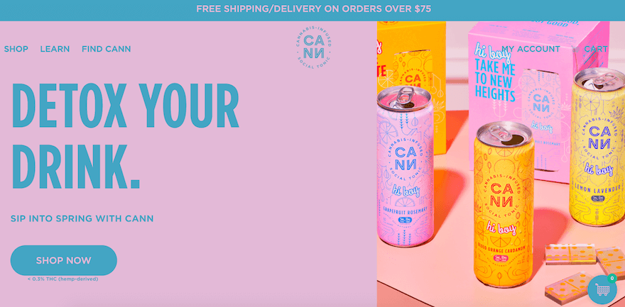
Filled with color and effervescence, the website releases rising bubbles as you scroll –mirroring the product itself, while giving the user experience a sparkling quality of its own. Better still, if you give the screen a quick, up-and-down scroll, the bubbles rise even faster – mimicking the effects of giving the can a short, sharp shake. Inspired!
5. Epicurrence
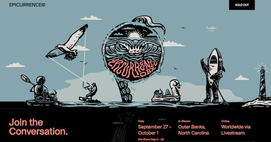
Epicurrence is a four-day in-person and online event billed as “a conversation on design, career, and personal growth”. It’s an inviting, inspiring sentiment – and boasts the website to match.
The Epicurrence website features unique, cartoon-like designs – a shark on a standup paddleboard, a lighthouse, the searching tentacle of a deep sea creature – in the header. Set against a backdrop of clouds that slowly move across the horizon, it gives the creatures a vague sense of movement – the impression that they’re slowly drifting across the screen.
It’s a wonderful touch, and imbues the site with a sense of life; a dreamlike quality, which serves as a neat counterpoint to the actionable, concrete skills the event’s participants will walk away with.
6. ToyFight
There’s never a dull moment on the website of ToyFight – an award-winning digital agency based in Manchester, United Kingdom.
The website harnesses parallax scrolling principles to layer its text over images of toys in various states of action and repose – giving the brand an overwhelming sense of innovation and relevance. We get the feeling, after exploring ToyFight’s website, that it’s an agency operating at the peak of its imaginative and creative powers.
Even the menu bar is in on the action. As you progress down the page, the menu bar jitters up and down, layering itself in with an endearingly ostentatious display of attention-seeking. Scrolling down ToyFight’s “Awards” section, a big number flickers into life, increasing rapidly until it reaches 52 – the number of times ToyFight has been formally recognized for its work.

7. Landor & Fitch
Landor & Fitch’s website opens with a simple statement that encapsulates what the brand does: “Transformative brands, made extraordinary by design.” It’s a big statement – but one Landor & Fitch absolutely live up to in the design of its own website.
When you land on the homepage, a video starts playing, showcasing a summary of Landor & Fitch’s work for top clients. Scrolling over this video brings up a triangular play button which, when pressed, brings up a full-screen image of the project – inviting the user to learn more, and explore that portion of the portfolio in more detail.
Further down the page, you’ll stumble upon Landor & Fitch’s brand “wheel” – a circular diagram that rotates as you scroll. Each section of the wheel corresponds to one of the brand’s key services – including brand strategy, brand experience, brand expression, and more – and you can click them to explore each offering at greater length.

8. Unfold
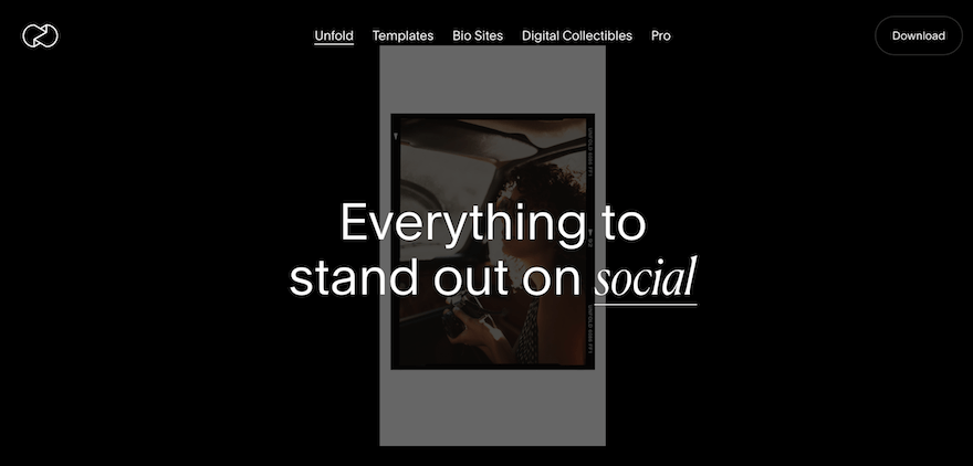
A Squarespace site, Unfold’s homepage is set against the backdrop of a Polaroid picture. As you scroll, that image gets larger or smaller, depending on the direction of the scroll.
Explore further, and the site’s “Digital Collectibles” section features an array of images that contract, expand, and move according to the action of your cursor. Animations dance and flicker across the screen, before giving way to dynamic, dazzling full-screen images.
We won’t spoil this one any further – go check it out, and you’ll see what we mean!
9. Bagigia
Bagigia is a purveyor of leather accessories – and it uses the parallax scrolling technique to shine a light on its flagship product, a bag with a highly unique design.
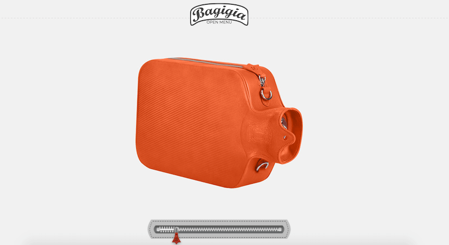
Scrolling over the image of the bag exposes the user to a plethora of different angles of it – allowing them to understand the bag’s size, shape, and super specific aesthetic qualities. Below the image, there’s a zipper. Clicking the zipper and sliding it across achieves the same purpose as scrolling over the image – causing the bag to twist and turn, and bringing up handwritten annotations that highlight the bag’s key features.
Again, you’ve really got to try this one out for yourself – particularly if you’re a fashionista!
10. Dockyard Social
Dockyard Social’s site fuses parallax scrolling with images, copy, and design that reflect the unique vibe of Scotland’s street food markets.
As you scroll, large yellow arrows – part of Dockyard Social’s striking brand palette – float up the screen in self-perpetuating rhythms. While a circle of words summarizing Dockyard Social’s philosophy – “Eat Well Do Good” rotates in time with the scroll. In terms of raw functionality, it doesn’t offer much – but aesthetically, it goes down a treat!

11. Delassus Group
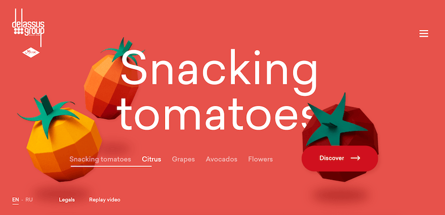
Rounding out our list is Delassus Group: a Moroccan grower of snacking tomatoes, citrus fruit, flowers, avocados, and grapes. Quite a selection – but as it turns out, the real snack here is Delassus Group’s gorgeous parallax scrolling website.
From the moment you land on it, the website is a colorful barrage of images – which cycle rapidly in front of the eyes, advertising the key USPs and vision of Delassus Group.
Following this minute-long slideshow, you come to the homepage. Here, the parallax scrolling techniques allow you to flick easily between the company’s various product offerings. As you scroll horizontally between the different fruits, the color of the background changes accordingly: from red with tomatoes, to purple with grapes, to green with avocado.
It makes for an immersive experience that, quite frankly, makes reading about tomatoes far more fun than it has any right to be!
Summary
Parallax. It’s not a science fiction film – or some benevolent, environmentally conscious robot from centuries to come.
What parallax scrolling is, though, is the future – meaning it’s something your brand needs to know about. Parallax scrolling creates immersive, engaging visual experiences – weaving narratives around your business into a seamless flow of images, designs, and movement.
With the 11 parallax website examples we’ve presented here, you’ll be ready to take the plunge – and implement parallax principles into your website. But, er…how?
To get you started, we recommend checking out our guide to the best website builders. With the right website builder powering your online presence, you’ll have safe, sturdy foundations in place upon which to elevate your site’s design through parallax scrolling.
We also suggest checking out our guide that explains how to design a website, as well as our breakdown of the latest web design trends and statistics you need to know about. From mobile UX and user-generated content to interactive elements and voice-activated SEO, it covers all the bases – so go enjoy, and let us know what you think of that article (and this one) in the comments section below.
Leave a comment