Demystifying Heatmapping: A Guide to Visualizing Data With Heat Maps
Our independent research projects and impartial reviews are funded in part by affiliate commissions, at no extra cost to our readers. Learn more
For website owners concerned about conversion rate optimization, heatmapping can help you understand how users behave on your website. It can show you where they click, where they scroll to, what content they engage with, and what they choose to ignore. More crucially, it shows you the areas you need to improve to get more conversions.
In this article, we’ll talk you through what heat maps are, how to create your own, and importantly, how you can visualize the data and use it to optimize your website.
Let’s get stuck in…
What Is a Heat Map?
First things first, what is a heat map?
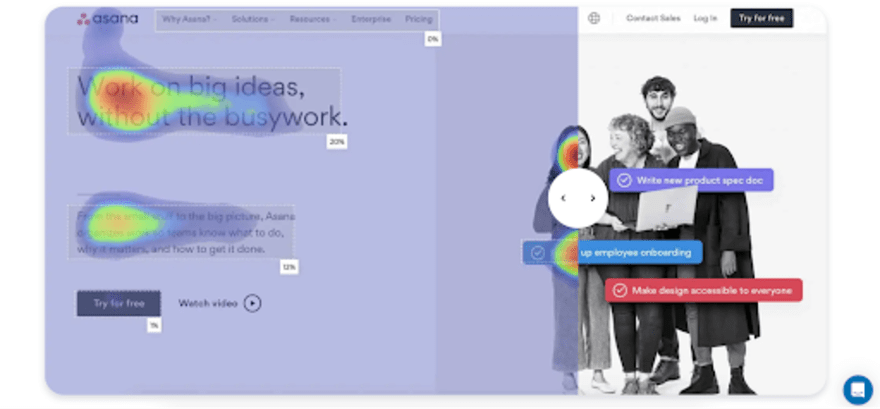
A heat map is a graphical representation of data that uses color to represent different values and elements.
Heat maps focus on user behavior on your website, giving you in-depth information about how visitors use your website, what’s working well, and what could be improved.
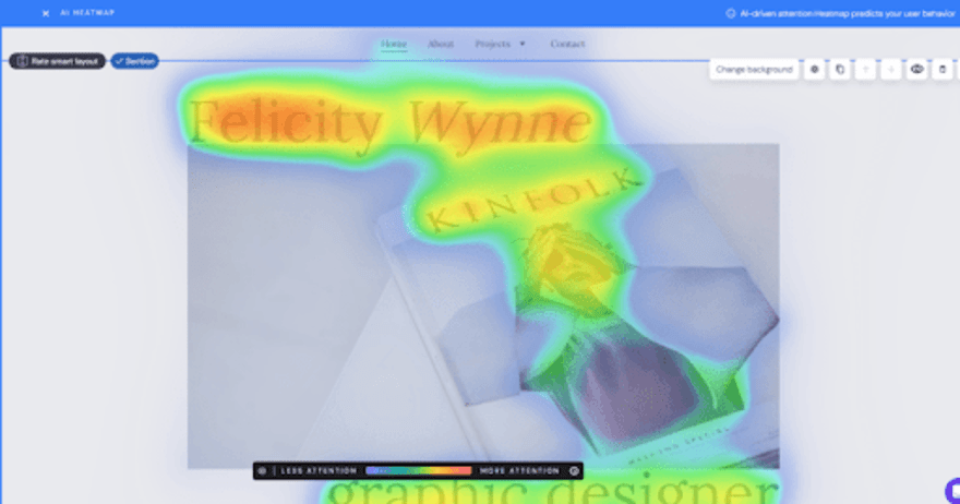
The traditional heat map color scale goes from red (for the most popular areas of a web page) to blue (for the least popular areas). By using color, heat maps make it easy to visualize huge amounts of data relating to your website. A heat map can provide insight into:
- Where a user clicks on your website
- How far a user scrolls on a web page
- Where users move their cursors to on a web page
- What content attracts a user’s attention
Creating Heat Maps
So, now that you understand what heatmapping is, how do you get started?
Luckily, there are plenty of tools online dedicated to creating heat maps. Before you choose a tool, you’ll need to determine which one is right for you. You need to think about the types of heat maps you want to create and how much budget you have to spend.
Some of the best heatmapping tools you can choose from include:
- FullStory
- Smartlook
- Attention Insight
- Mouseflow

Once you’ve chosen the right tool for your heat map, you then need to:
- Decide and set your teaching settings and goals: What do you want the heat map to track?
- Choose the specific web pages or areas
- Generate your heat maps to visualize your website data
- Monitor and analyze the data from your heat map
Advice from the Experts
Top Tip: Remember that users access your website using various devices so their screen sizes differ. We recommend creating and analyzing separate desktop and mobile heat maps to gain an accurate insight into how visitors use your website.
Interpreting Heat Maps
Once you’ve created your heat map, you need to know how to interpret it to use the data effectively.
We’ve broken down what you should be looking for when it comes to different types of heat maps.
Click Heat Maps
You can use click heat maps to identify both popular and neglected areas of your website. Take a look and see which areas, buttons, links, and CTAs have the most engagement and which ones are being ignored by users.
If there are areas that aren’t getting many clicks, you know to switch up the buttons and links you’re using.
Click heat maps also provide you with an understanding of the navigational journey users are taking on your website, allowing you to see how they’re reaching certain pages. This can be useful when you’re analyzing your customer journey and lifecycle.
Scroll Heat Maps
Scroll heat maps tell you how far down a page a user is scrolling. This data is super helpful and allows you to pinpoint attention-grabbing content and understand whether or not users are finding your content useful.
If they aren’t making it to the end of the page, it suggests that they have either already found what they’re looking for or your content isn’t engaging.
You can also see if there are areas of the page that are frequently the “endpoint” for a user’s scroll. If so, this suggests that the content in this area is causing premature exits from your site and may need to be switched up.
Mouse Movement and Attention Heat Maps
Mouse movement and attention heat maps allow you to see where users are moving their cursors and what is catching their attention the most.
From this, you can see what content is resulting in high user attention – we recommend using this information to help shape your long-term content strategy.
You can also use the data from these types of heat maps to begin to understand how users consume and read your content. Once you understand this, you can determine if you need to change the format of your web pages for better readability.

Website Optimization with Heat Maps
Heat maps allow you to work through masses of data and easily spot any trends or issues. You can use the data and insights from a heat map to optimize your website, ensuring you’re offering the very best user experience.
So just how can heat maps help your website optimization?
- Heat map insights allow you to enhance the user experience by altering your website to meet the behaviors and actions of users
- Heat map data allows you to edit and optimize the layout and design of a web page, ensuring the right elements are in the right place to generate ultimate user engagement
- Click heat maps enable you to improve your CTA placement, boosting their effectiveness and increasing your conversions
More Information
Want to delve deeper into how to optimize your web pages? Take a look at our expert guides to optimizing your product pages and checkout page optimization.
Heatmapping Best Practices
Now that you’re ready to create your own heat maps, make sure you follow the heatmapping best practices we’ve listed below:
- Ensure your data is accurate and that you are using an appropriate sample size for your heatmap. In all honesty, a heatmap that tracks the activity of just two users won’t be very helpful.
- Consider your user demographics and audience segments. Some tools allow you to break your heat map down via key demographics, such as location and customer type (e.g. return visitor).
- For the best insights into your website performance, combine the data from your heat maps with other analytics tools, such as Google Analytics.
- Remember that handling large amounts of data also comes with privacy and ethical considerations. You need to make sure your visitors are aware that you’re tracking and monitoring their behavior on your website.
Demystifying Heatmapping: Summary
Heat maps are a useful tool to have in your online toolbox, allowing you to gain an in-depth insight into how users are behaving on your website.
Unless you plan to physically sit beside them and watch what buttons they click, where they scroll to, and where they move their cursor, a heat map is the best way to get inside the mind of your website visitors.
With so much data available to website owners, heat maps help to streamline and categorize critical data points, allowing you to easily identify trends and any problem areas.
Now that you understand what heatmapping is, all that’s left for you to do is to go away and begin creating your own. Make sure you let us know in the comments what insights you discover!
Frequently Asked Questions
A heat map shows a color-coded breakdown of mouse movements and clicks on a web page. The color-coded breakdown usually rests over the web page so that you can visually see trends and problem areas.
There are two ways you can read a heat map. You can look at the color-coded visualization or the raw data points. The visualization of the heat map is great for an overview of user behavior while the raw data provides deeper insights and detail on how users are behaving on your site.
Any script you add to your website has the potential to slow it down and heat maps are no different. However, many of the main heat map services are designed to have as little impact on the speed and function of your website as possible.
Leave a comment