10 Travel Website Design Examples to Inspire You
Our independent research projects and impartial reviews are funded in part by affiliate commissions, at no extra cost to our readers. Learn more
After a rollercoaster few years with Covid-19 significantly disrupting travel plans, the industry is now booming. And who can blame us: there’s nothing like being stuck inside your home for long periods of time to make you want to… leave home!
The growth in the travel sector means that there are more websites geared towards helping travelers than ever before. And believe us: not all travel websites are created equally!
This article will walk you through the basics of travel website design, and show 10 brilliant examples of websites that have got it right. Read on for some top tips and to get inspired to make or improve your own website.
What Is a Travel Website?
A travel website is any site that’s set up to provide information or inspiration for wannabe travelers.
For example, some users will want to be inspired and gather ideas, so there are websites specifically set up to showcase what different destinations have to offer, allow you to read reviews from previous travelers, or to map out potential journeys.
Other travel websites are more practical and set up to help travelers organize a trip, such as comparing prices or accommodation options, and then making a booking.
Why Does Design Matter?
We’ve included all types of travel websites for the various phases of the traveler customer journey, so you can compare their features and designs.
We think design is one of the most important factors of any travel website. Ultimately, a travel website is selling an experience, and a well-designed, visually-impactful website will be far more likely to leave a positive impression on the visitor.
Travel Website Design Inspiration
Ready? Let’s dive into 10 of the best travel website design examples:
#1. Lonely Planet
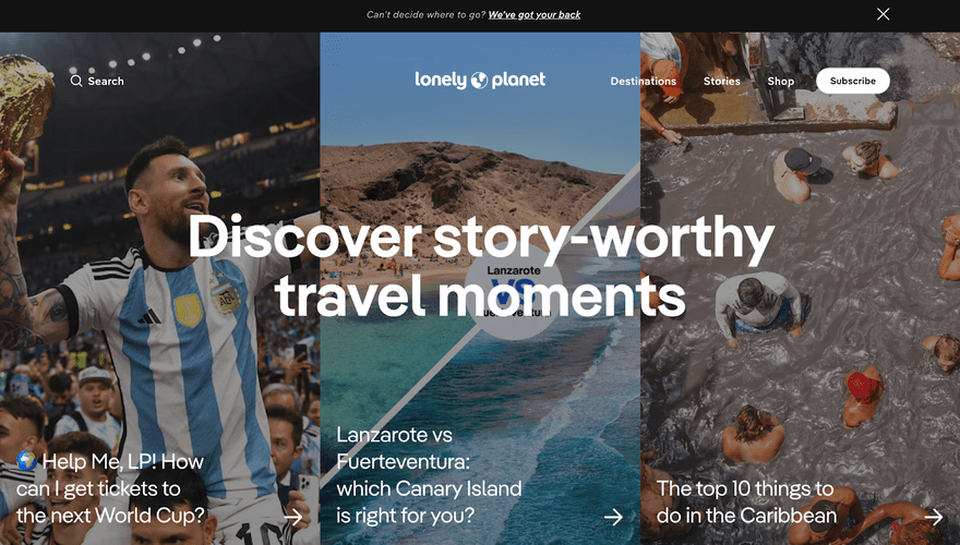
Lonely Planet is one of the OG travel companies, having published over 150 million travel guides over the past five decades! Nowadays, Lonely Planet is one of the best travel websites on the planet, with a super simple and impactful website design.
The use of bold photography paired with white text is highly effective, and something you could consider for your own site.
The website is especially well-designed for users searching for inspiration. We love the “Can’t decide where to go?” banner at the top of the homepage, and the section which divides destinations into categories such as “Learn,” “Cook,” “Connect,” and “Unwind” to help narrow down options.

#2. Secret Escapes
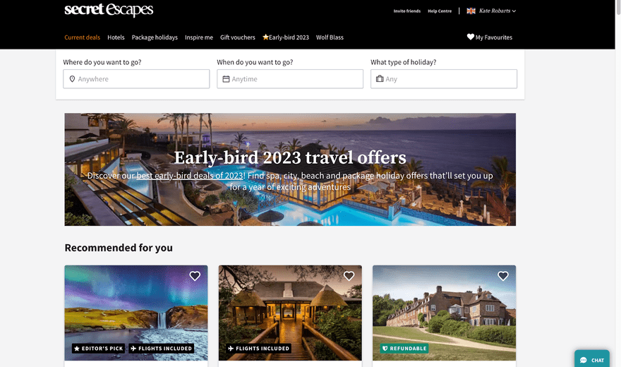
We love the Secret Escapes website for the variety of travel ideas it provides. On the same page you can consider a cozy English cottage, next to a wild African safari or an uber-cool Ibiza yoga retreat!
The carefully-considered design means that despite the potentially overwhelming options on offer, the site is clean and easy to use. Clear labels such as “Editor’s pick” or “Flights included” help with the decision making process, and we like how you can search “Anywhere” or “Anytime,” or be more specific.

#3. Skyscanner
Skyscanner is single-minded in its mission: matching people to flights. A staggering 100 million people use the site every month, and it’s available worldwide in over 30 languages.
What makes this site so compelling? We think design plays a big part. A full screen image provides a striking backdrop to this powerful search engine, and the homepage is purposefully stripped back and simple.
The search function has clever features such as the ability to find the cheapest month to travel in, and the option to filter searches by their departure time or number of layovers. Simple yet beautiful.

#4. Tripadvisor
Everyone knows Tripadvisor as the go-to review website for checking how local restaurants rank, but did you know it can also be used for booking accommodation and things to do?
We think you’ll agree, the colorful Tripadvisor website is a treat for the eyes, all thanks to a relatively recent rebrand and redesign. Their homepage is unique among travel sites for opting for an illustrated homepage rather than photography. You could try this on your own site, as illustration is a surefire way to inject some fun and personality!

Find Out More
Color is another great way to inject personality and branding into your travel website design. Check out our guide on How to Choose a Color for Your Website for more tips!
#5. Interrail Europe
Interrailing is a way to travel the length and breadth of Europe by train, with lots of different passes and packages available.
The best part of the Interrail website is the trip planner tool. This allows a visitor to build a fully customized itinerary with dates and locations, and see their trip mapped out. Adding clever tools such as this to a website will ensure visitors find genuine value in your content, spend longer on your site and build up genuine excitement about their trip.

#6. Visit Australia
Search “Visit…” and the name of practically any country, state, or holiday destination, and you’re likely to come across an official-looking tourism website.
The quality of these websites varies greatly, with some unfortunately providing biased or generic information. However, there are many good examples to take inspiration from, and the Visit Australia website is a standout example.
What we particularly love about the Visit Australia website design is the fun interactive elements, epitomized by “Ruby” the bouncing kangaroo who guides you through your trip to Australia. Ripper!

#7. Greyhound
“I ride the greyhound bus, I ride it everywhere…” so goes the song about the USA’s most famous bus service, which has also featured in too many movies to count.
Anyway, enough about film and music, we’re here to talk about design. The Greyhound bus website is practical and functional, primarily catering for travelers who wish to compare and book trips across the states.
A particularly neat feature of the Greyhound site is the “Explore” section, which lists the most popular destinations alphabetically. Striking photographs overlaid with a greyscale is a clever design technique which makes photos appear more uniform.

#8. Hostel World
Budget-conscious travelers will be familiar with Hostel World, the world’s most famous search engine for affordable accommodation.
A key lesson to learn from the Hostel World website is that, when it comes to design, less is more. Their homepage is intentionally clean and simple, with only the most essential information on display. “Meet the world” provides an inspiring and motivating strapline, and asking a simple question “Where do you want to go?” invites the user to explore.
Advice from the Experts
Top tip: Love the website design examples you’re seeing here? You can learn more here about how to choose your website template.

#9. Wwoof
What is Wwoofing, we hear you ask?! Wwoof stands for “Worldwide Opportunities on Organic Farms,” and the site is all about matching up visitors with organic farmers, to create a global ecologically-conscious community.
Sounds cool, right? But perhaps a little complicated? The Wwoof website recognises that users may be unfamiliar or daunted by the idea, so utilizes a carefully-designed step-by-step guide to help visitors choose a country, explore hosts, sign up, and plan their stay.

#10. Airbnb
Last but not least, we couldn’t explore the world of website design without mentioning Airbnb. Before Airbnb came along, websites for booking homestay accommodation were disparate, difficult to use, and inelegant. We believe a huge part of the success of Airbnb is down to the organization’s commitment to fuss-free, impactful design and clever innovations.
The search functionality has been expanded over the years, and now includes the option to search for “Treehouses,” “Shepherd’s huts,” “Castles,” or even “OMG!” properties. These categories are demonstrated through the use of simple icons, which add a cute and minimalist touch to the designs.
Advice from the Experts
Top tip: Use a mixture of vibrant photography with simple icons to create a well-balanced homepage

Summary
Remember, think about the needs of the user visiting your site, and what stage of the customer journey they might be at.
Consider using vibrant photography or illustrations to inspire the potential traveler, an inspirational travel blog, or perhaps an interactive tool to help bring their journey to life. And for more practical sections of your site, try using icons, step-by-step guides or smartly-designed search engines.
That’s it, folks! We hope this has given you a taste of some of the best travel website design out in the world, and provided inspiration for your own site. Travel is a saturated marketplace, with thousands of websites competing for visitors. This means that design which is both impactful, beautiful, and functional is more important than ever.
Leave a comment